Showing posts with label My Favourite Makes 2014. Show all posts

Thursday, 21 August 2014

Compendium of Curiosities Challenge 9


It is Challenge 9 at CC3C - with the focus this time on page 63 of Tim Holtz's fab book - 'Stamps and Framelits'. As usual great prizes up for grabs courtesy of Tim Holtz and Inspiration Emporium.

 I wanted to use my recently acquired 'French Flight' stamp and framelit set but decided to take a slightly different approach than I have used it for to date. I decided to go geometrical with my Eiffel Tower stamp and framelit. I was originally going to have the butterflies fluttering around the towers, but it just seemed to ruin it - so kept it simple.
My background is kraft card with stamps from Papillon and the above mentioned set. I then set about my Eiffels!


Thanks for looking
Nikki
xxx

Thursday, 14 August 2014

Words, Words, Words

I am going to keep this brief as I have a lot of photos - sorry! I decided to make a book (4''x 4'') for the latest challenge at Country View Crafts - Word Play. A book seemed the most apt format for this challenge. My theme is on writing - Letters, Postcards, Journals (or diaries) and Books - so there is a page or double page for each.

I started with kraft card to construct my book and then worked on the backgrounds for each page (lots of inking with distress inks and stains, stamping, embossing, splattering etc!). Once they were all done I constructed it and then set about embellishing each one with the theme it related to. Ok, ironically for my Words project- I will let the photos do the talking!  
My kraft card and page backings
Front cover
Inside Cover
Double page 1 - Letters
Double Page 2 - Books
Double Page 3 - Journals and Diaries
Double Page 4 - Postcards
The Back Cover
A few close ups:
I will also play along at:

Thanks for looking
Nikki
xxx

Tuesday, 22 July 2014

Things with Wings at Try it on Tuesday


We all love 'Things with Wings' and that is the theme for the next 2 weeks over at Try it on Tuesday. This gave me the chance to play with my new Tim Holtz die and embossing folder (yum!). I also added crackle paint to this one for some added texture. The green background layers are made with Distress Inks and stencils. 
I would also like to play along at:

Thanks for looking
Nikki
xxx

Monday, 14 July 2014

Sunshine and Showers


It's time for Tim's Tag for July. Unfortunately I don't have the dies he used so a little improvisation was needed. I did create a little story around this but it sounds silly now! To summarise; umbrella man (in his wellies) goes for a walk (with is good friend the blue tit) in the sunshine and showers. 

A few more piccies:


You can see Tim's wonderful tag here.

Thanks for looking
Nikki 
xxx


Sunday, 29 June 2014

Face in the Crowd for Compendium of Curiosities Challenge 5


Over at Linda Ledbetter's Compendium of Curiosities it is time for Challenge 5 - Distress Watercolouring. I decided to take the classic faces images and watercolour the beautiful girl. I had to go a bit weird and set her on a some eyes and lips each cut to create tiles. Still trying to decide is this is a terrible composition or not - it feels wrong, but I strangely like it. They are all mounted on chipboard which I covered with Tim paper and sanded and distressed at the edges.

This time the challenge prize is provided by Inspiration Emporium - $50!!

Here a couple of close ups:


Thanks for looking
Nikki
xx


Friday, 13 June 2014

Wings and Things at A Vintage Journey


Over at A Vintage Journey the new challenge is a great one - Wings and Things. As usual projects should be Tim inspired and vintage but can be 2d, 3d - anything you like. Check out the projects from the rest of the DT over at the AVJ site. The main Tim influence for me on this project was using his fab papers.

My project started as a humble, plain canvass that I have used the reverse side of to create a sort of box frame. I first added some texture paste around the frame randomly but ensuring I covered the staples holding the canvass on the frame - this just gives added random texture. I covered it all in gesso (including the reverse to stiffen it a little) and once dry added some more texture paste through Tim's heart stencil. I painted it all with chocolate pudding fresco paint and crackle glaze before adding stone fresco paint. This didn't really work (no cracks!) -so I went back over, inconsistently with chocolate pudding (to keep it dark) and highlighted the hearts and other random areas with Treasure Gold. Here is a close up:


I then proceeded to cut some Tim paper for my background and some chip board for the panels to go in it. I added tissue tape, a Tim swirl stamp and some remnant rubs before edging with DI.


The little panels were cut from same paper and glued to chipboard, the edges sanded and inked before adding remnant rubs.


Of course I had planned where my embellishments were going to first (well just about!)
My butterflies are from various sources including a Tim savage sticker, Stampin Up stamp on Tim paper and a Clarity stamp butterfly.


A few more piccies:


Thanks for looking
Nikki
xxx

Saturday, 7 June 2014

Time to Remember


It is June and that means Father's Day and also it would have been my Dad's birthday. There are alot of challenges focussing around this theme this month. I decided to make a little book in memory of my Dad and also a very good male friend who passed away last year.

I must give credit for the idea and design of the book to the wonderfully talented Candy Colwell - I saw this a while ago and wanted to make a little book like it! Here is the link to Candy's great tutorial on how to put the book together. I didn't use money envelopes but just pieces of kraft card to make my pages.

The inside cover and first double page are for my Dad and the second double page and back cover for Ron. They had very different personalities so the themes are quite different! 

I used lots of Tim Holtz papers, stamps, inks, label letters, remnant rubs and alpha tiles. There are also a couple of Artistic Stamper stamps (the lovely girls) and the clock is from heartfelt creations.

For Dad:
Dad was an engineer and very precise and ordered so his collage page represents this.


For Ron:
Ron was more flamboyant, loved to travel and liked the ladies! I tried to represent this in his collage page.


So there is my little book...


I would like to enter this into:
and finally:
Fashionable Stamping Challenge - Like Clockwork (with my focus on time to remember I feel this is suitable)

Thanks for looking
Nikki
xxx


Friday, 30 May 2014

It's all about Texture at A Vintage Journey


Hi everyone - it's time for another challenge at A Vintage Journey and our host this time, Jenny, has asked us to 'Get Some Texture'. As usual it is all about being Tim Holtz inspired - whether it's the techniques or products. It's both for me today - with the focus on the techniques he uses for creating texture.

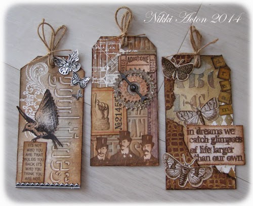
I produced a set of tags all using slightly different texture creating techniques - although I started each of them with a background stamp, embossed with white embossing powder. On the left it is a flourish, the centre a blueprint stamp and on the right the harlequins (mostly hidden now).


Tag 1:
For this tag I used one of Tim's debossing folders - I found it quite difficult to only get the ink on the area to be debossed so I used the other technique he offers us of highlighting the debossed area afterwards with distress markers. Anyone else having trouble with this? - maybe my ink pads are too juicy but I get ink on areas other that the text when using the pad!

Also on this tag I created my textured butterflies by embossing some foil tape sheets which were then highlighted with black paint. (The butterfly embossing folder is from my stash - I then cut out the butterflies.) Some stamping, inking and an industrial border finished this one.


Tag 2:
My second tag used embossing paste through Tims cargo layering stencil which I then highlighted with various inks. I also added part of a failed tag - paste through the burlap layering stencil which I tore pieces off and added to this tag to create additional texture. 


Salvage stickers and the sentiment were then added. I like this one the best!


Tag 3:
The final tag used a texture fade - sorry can't remember what it is called. Distress inks were added to highlight the embossed areas.


I also added some cogs from my stash on this one. I often add embossing powder to my cogs (eg ranger antiquities) to create texture which I then ink over or use gilding wax.

I added a game spinner and some stamped images on this one too. As the stamped images were to be placed over textured surfaces they were cut out first of course - adding increased dimension.


So texture fades, embossing powder, layering stencils, debossing folders and foil tape sheets - lots of Tim texture! There were actually five made - so I may share the others later.

Don't forget to visit A Vintage Journey to see the amazing creations of the other Creative Guides.

Thanks for looking.
Nikki
xxx